The photocopier was invented for graphic arts, so when great technical improvements occurred in the 1960s and 70s, artists were immediately attracted to copiers as a graphic arts medium. One of the pioneers of copier art was Wallace Berman, he worked with a wet process known as Verifax. Berman's work was influential, but complex wet processes are barely an improvement over photo darkroom processes.
Copiers were designed for reproducing text or line drawings, the high contrast copies made it difficult to reproduce photographs or continuous tone artwork. But in the 1970s, a photographic quality copier was in widely distributed, the 3M VQC Copier. Artists loved it, a coin operated VQC copier was available at a local public library, artists like me lined up to use it for hours at a time.
One of the great features of the VQC is that you could run copies through multiple times, overlaying images. Each pass through the copier had a different tonal quality, and you could change copier settings for more effects. You could also draw on the copier paper with markers or silverpoint before printing on it, the copier toner would not adhere to the drawing. Direct manipulation of the copy process was easy, but the results were unpredictable.
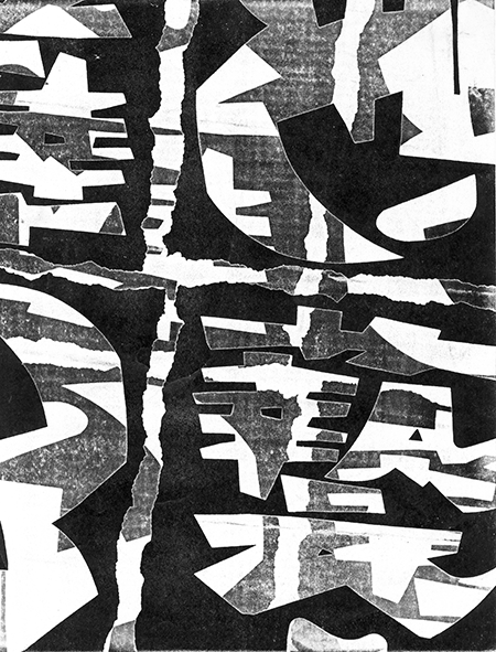
Here's an image I made sometime around 1975. It's a copy of a bold graphic poster from Japan, run through the copier twice. The second impression is gray, offset from the first. If this artwork turned out well, it was probably because of the graphic artist who made the original poster.
Copier art was a revolutionary technique in modern mechanical reproduction. Some graphic artists started using copiers to enlarge images, rather than using projector systems like the Lucygraph. Some artists even turned copiers on their side and used them as cameras, foreshadowing the digital camera. But in the Postmodernist aesthetic, copiers were used to produce flat images, reducing the world to two dimensions, stamped out repetitively.
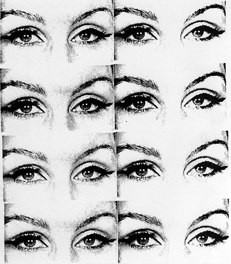
Here's another copier artwork I made. It's taken directly from the VQC copier repairman's test image. This is just an intermediate stage of preparation for the final artwork, made by cutting up copies and gluing them together. You can see the image is produced with halftone dots, It's line art so it's not really photographic and not much of a challenge for the VQC. But it's easy to chop up any old image and change the meaning by multiplying it. You might be able to tell the eyes on the left have more detail than the eyes on the right (a second generation copy). You could manipulate detail and add noise by making multiple generations.
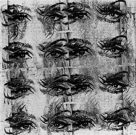
Here's the final artwork, run through the copier over and over, in different orientations. Each generation added more grainy noise. I thought this gave the final print some richness that was lacking in the original line art.
Each of these images are the width of a sheet of copier paper. I wish I could reproduce them larger, so you could see the rich detail, but alas, I can only provide thumbnails, to prevent my images from being pirated. Note that these images (like all original content on my blog) are copyrighted: Copyright © Charles Eicher 1975-2011.
It wasn't a great leap from the copier artists of the 1970s to the desktop publishing revolution of the 1980s. But perhaps some of the fun went out of the medium. LaserWriters with digital input always gave you the exact, precise results. You never knew quite what you were going to get with the old analog copiers like the VQC.
Leave a comment