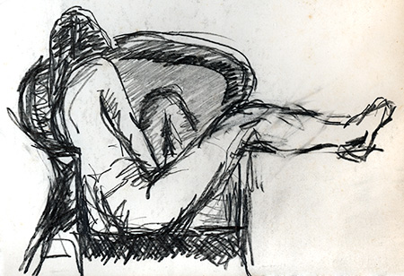
I was going through some folios of old artwork and found this little sketch from my oldest Life Drawing classes. This must date to around 1976. I was a total rookie at drawing, this is kind of embarrassing, but I can see some good qualities here. This sort of artwork would be considered "juvenilia," work done as a young artist who hadn't quite figured out what he's doing.

Now obviously I'm struggling here with the proportions of the leg, there are some erasures and I probably had it better before I erased it. The leg and torso are presented flat in the picture plane, so I did have some sort of idea of what I was trying to do with this drawing. The left leg also has problems, but it is shaded in a way that pushes it back from the picture plane. You can see it took me a couple of tries to get the round shape of the wicker chair, but it's shaded rather nicely. There are two or three different pencil hardnesses in use here.
But I am rather more pleased with the torso and shoulder, the proportions are right and it forms the front plane with the leg. It's hard to indicate the roundness of forms when you draw in these sketchy strokes, executed so rapidly. But the sketchy strokes work well when just suggesting the shape of a shoulder blade, the shadow under the upper arm, or the shape of the hips and buttocks. The round curves in the back of the chair pull the picture inward, while the square front of the chair helps establish the front plane of the model.
The problem with this sort of life drawing is that the poses are only a few minutes, so you don't have time to work everything out. The classes are designed to help you work out your issues with proportion and lighting, but you can only work on a couple of things in a single drawing. It's almost impossible to get it all right.
This drawing is about six inches across, in the corner of a large 18 x 24 inch sheet of paper. The full page is taken up by an unfinished sketch in large, rough, black chalk, working out the composition. It is obviously abandoned but has the same composition as the sketch. I can tell I did a quick chalk sketch but didn't like it, and didn't want to waste the whole sheet of paper, so I did this little sketch in the corner.
I am not an artist with natural draftsmanship skills, it's hard work developing those skills. I still have poor draftsmanship, which is pathetic because I have a BFA degree in Drawing and Painting. Obviously being unable to draw well is not an obstacle to an art degree in Drawing. I recently did some Life Drawing studio sessions and I can tell I still struggle with the same problems of body proportion and how to convincingly portray it. Now I have other qualities that help my drawing rise above the level of just another poor draftsman, and I can see some faint impressions of my current drawing methods in this old drawing. That's why artists sometimes keep juvenilia, to compare it to their current work, and see where they came from.
It's interesting to compare to what other work I was doing in art school at that time. I might have been at the cutting edge of computer graphics at the time, but I still had to take the basic Life Drawing classes, like every art student. Today, every art student wants to do computer graphics, but I've done that. Now I'd rather do Life Drawing.
Leave a comment