April 2003 Archives

Japanese consumers are extremely well educated in the most trivial aspects of every product. In many cases, the presentation and packaging may be as important as the contents, and consumers are extremely particular about their preferences. It appears that this consumer education starts very young, as this video from a popular FujiTV morning show reveals. This video (4 minutes, Japanese subtitles) reveals knowledge sought throughout the ages, the secret Egg Salad Sandwich Recipe.

Get QuickTime5
Can't see BlogTV?
Click Here.

Little 5 year old Hazuki-chan has written a letter to the morning show. She has a complaint, her Mommy's egg salad sandwiches are boroboro, sloppy and loose. They're not perfect like the lady-finger sandwiches you get in a store or restaurant. Hazuki-chan whines, why are Mommy's sandwiches so crappy?
First, a little background is in order. Japanese bread is usually sold in loaves with the end crusts cut off, because nobody likes the crusts. The slices are usually extra thick so it's easy to slice the crust off the edges. If you order a sandwich at a shop, it will usually come with the crusts cut off and sliced into four wedges.
As Mommy prepares Hazuki's sandwiches, the announcer observes the problem, he shrieks kuzureta (it's crumbling) as she tries to slice the bread into quarters. Of course proper video coverage must include interviews of people in the street, to see how the average person would attempt to cut their sandwich. They all have sloppy, loose sandwiches, just like Hazuki is complaining about.
Let us instead visit the hallowed halls of the Tokyo Culinary Institute, where dozens of professional chefs are prepared to examine this problem. A master chef demonstrates a common technique, the sandwich is wrapped tightly in plastic cling wrap and sliced right through the whole package. It works well but it's time consuming and wasteful. On the other side of the kitchen, a row of students are mass producing sandwiches, they seem to be working much harder than the professor with the cling wrap. They're chopping stacks of sandwiches into neat halves, using long knives. One woman declares the secret is the special knife designed just for this job, it would be impossible without the proper knife.
But the proprietor of a local izakaya insists that he can make a pefect egg salad sandwich with any old knife. So FujiTV brings Mommy and her old knife along so he can teach her the secret recipe.
The usual ingredients for this sandwich are a slice of lunch meat (looks like chicken or turkey), some lettuce, mayonnaise, and a dollop of egg salad. The threefold secret of the sandwich is thusly explained:
1. The hardest to cut ingredients go on the bottom. That means the lunchmeat goes first, then the lettuce. If you put them on the top, when you try to cut it, it just squishes.
2. Squirt some mayo in the center. This keeps the bread from getting soggy.
3. Hold the sandwich at the edges while cutting the diagonals. Hold the sliced halves together and make a second slice through everything, into quarters.
After all this research, we are reassembled at little Hazuki-chan's lunch table, to place a new set of perfect sandwiches in front of the most spoiled child in all of Japan. Hazuki merely declares they are better than they used to be.
BlogTV: Steve Jobs on CNN

| 10 Comments
I was surprised to find Steve Jobs' announcement of Apple's new music service online only in Windows Media Format through MSNBC. But a few minutes later, I happened to see Jobs on CNN, so I rewound the TiVo and captured it for everyone to see.
Get QuickTime5
Can't see BlogTV?
Click Here.

This is an experiment in "time-to-live" BlogTV, the interview took place around 2:15, the compression is done and I'm putting this online at 3:40. It takes extra time to prepare streaming video, I could have put it online in about 15 minutes but I must make the video non-copyable in order to preserve my Fair Use rights while not getting stomped on by CNN Legal. This server is also a small experiment on a tiny DSL line so I apologize if there is insufficient bandwidth for large numbers of viewers. If you get the "Not Enough Bandwidth" error message, this means all available streams are already in use, please try again later. If you have other difficulties with the video, please leave a comment. I'd like to hear your experiences viewing the streams, that's why I'm doing this BlogTV experiment.

Magic D-Link Hub

| No Comments
I heard that some MacOS X users are looking for D-Link USB hubs. Apparently the MacOS X 10.2.5 updated USB drivers have bad mojo, using a D-Link hub is a known workaround. I have one of the magic D-Link hubs, it's been sitting in a drawer for years, but now I suddenly need an extra port so I hooked it up and everything works well.
There's only one problem with my USB scheme, I ran out of power outlets and I had to plug the hub's power block in to the circuit without a battery backup. My CPU has reserve power during an outage, but my USB hub would go down so I'd be unable to type or use the mouse to save my work.

Nelson Rockefeller and Bob Dole

| No Comments
Nelson Rockefeller

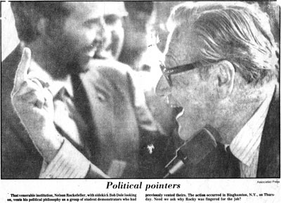
I was going through some files and found this newspaper clipping from about 1970. I thought I'd post it just for no reason at all. The caption reads
That venerable institution, Nelson Rockefeller, with sidekick Bob Dole looking on, vents his political philosophy on a group of student demonstrators who had previously vented theirs. The action occurred in Binghamton, N.Y., on Thursday. Need we ask why Rocky was fingered for the job?
My favorite comedy TV show, The Fall and Rise of Reginald Perrin is back on the air and I am jumping for joy. The show first aired in 1976 and I remember seeing it back then and declaring it the funniest show ever. Reginald Perrin may have warped my mind more than any other TV show, more than Monty Python or any of the other deranged shows I used to watch. There's no possible way to explain the show so you just have to see it. Be sure to watch it Sunday nights at 10:30PM on IPTV.

Backup

| No Comments
I just did something perilous, I did a complete backup of my webserver. I hate doing backups because it's always the time when an error could do the most damage. The only time I ever had a catastrophic data loss was when I did a backup of all my personal data. I used to put all my data into an early PDA-like product written in Hypercard. I was really organized, I lived my life through my online scheduler, and then one day I did a backup and it died right in the middle of the backup. Both the backup and the original went poof and I was never organized again. Since then I've had extreme skepticism about putting valuable personal data into any volatile storage media.
Due to the radical changes on this website, I decided I should set up a proper backup scheme. I set up the Retrospect client-server apps, it works great. I set a script to back up my web server to my desktop PowerMac's CDR, but it didn't verify, I wonder what went wrong. I suppose I should read the Retrospsect manual sometime. But it works OK backing up over the network to hard disk, my archive is only about 480Mb and will fit on a CDR so I'll just back up the server up over the net and put the local archive file on a CDR with Toast. I suppose I'd go to the trouble to get this all working properly if I believed in regular backups.

Safari MovableType Bookmarklet Fix

| No Comments
Jen has the fix for MovableType Bookmarklets, which don't work properly in Safari without some minor modification. I'm posting this mostly to see if TrackBack works, let's see if Jen's blog lists my referral.

Turn Off The Radio

| No Comments
I got a renewal notice from today, demanding $40 for another year's license for their Radio software. I refuse to pay another $40 for 12 more months of abuse by Dave Winer, as far as I'm concerned he personally owes me a $40 refund. So I'm migrating my old Radio blog with help of Bill Kearney's Radio Exporter. I've got all my old content imported into this site's archives, now I never have to deal with Userland and Winer ever again.
Turn Off the Radio

MovableType 2.63 Upgrade

| No Comments
Disinfotainment was down for a few minutes while I upgraded my MovableType setup to version 2.63. I seem to have all the old content and comments back in place, but reset to the default templates. I'll have to rebuild the templates properly, and do a few things right like I should have done in the first place. And now I can experiment with some new features like Trackback. It might get a little messy around here for the next few days.

MacOS X Safari Web Ad Blocking

| 2 Comments
Apple's new Safari browser works well enough to be my primary browser, but I wouldn't switch until an ad blocking system was implemented. I heard the latest 1.0bv73 version had popup blocking, but that isn't sufficient. I poked around the web and was surprised to see that Safari supports the same ad blocking techniques as Mozilla, using a css stylesheet.
I noticed Safari's Preferences>Advanced>Style Sheet allows you to set your own style sheet but I didn't immediately realize this was where you put your ad blocker. I downloaded one of the more popular Mozilla ad block userContent.css stylesheets, saved it in my home directory and activated it in the prefs, and ad blocking was activated. I've been editing the file in BBEdit but so far I've had a hard time improving on it. There are some tricks for blocking Flash files but they don't seem to work in Safari. Even so, I'm switching over to Safari because the ad blocking is now good enough to satisfy me in everyday use, and bookmark management is better than any other browser I've used.
Update 6/12/03: It appears this little summary is getting linked around the web, but my link to the stylesheet example at FloppyMoose.com is undergoing a temporary outage. Now you can download the stylesheet I'm using for my own ad blocking, I'll host it on my own site for a permanent reference. If anyone can improve on this stylesheet, I'd love to hear about it, so leave a comment.
Update 4/11/04: FloppyMoose has updated his ad blocking style sheets, with improvements, so check out his site and download the latest version.

Check Sheet

| No Comments
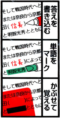
When I lived in Japan, I used to commute to school every morning on trains packed with kids on their way to school. I noticed many of the High School students were doing the strangest things, they all had little red and green pieces of plastic and little sheets of paper. I asked them about it and they said it was a Check Sheet, and they showed me how to use it.

Check Sheet

The Check Sheet is a simple study aid, widely used in cram schools in Japan. There are several variations but this illustration from the back of a Check Sheet package should explain the basic idea. The Check Sheet itself is a transparent rectangle of red plastic, usually about the width of a page. The Check Sheet system includes red and green pens and highlighters. You can see from the illustration that if you write in red, when you hold the red filter over it, the red text will be invisible. Use a green highlighter to cover a word, the red filter will make it opaque black. Very clever. There is a second type of Check Sheet, it is a bar of two strips of plastic, one red and one green. You can use the green side of the sheet, and the effect is exactly opposite, the green pen is transparent and the red ink is opaque.
I used to see kids cramming lists of English vocabulary written on little strips of paper. They would write a list of vocabulary words in English in red pen, and the Japanese definitions in green pen. They held the list under the Check Sheet, guessed each word, and then slid the sheet down one entry so the word popped up from the edge of the sheet, unfiltered, revealing the answer. Then you flip the ruler upside down and use the green side, and go down the list of definitions, written in green and now invisible. Very very clever. I liked this scheme so I bought some Check Sheets and the special pens, but I was unable to find the proper green pens and highlighters so I just used the red pens.

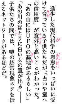
furigana

Here's a little sample of my furigana notes from a textbook I was using when I discovered the Check Sheet. My teacher would get furious if we put furigana notations in our textbooks. We would read these passages aloud in class, and if we had pronunciation hints, he thought it was cheating. But with the Check Sheet, I could keep the furigana concealed, only revealing it when I got stuck. I could practice it over and over, sliding the sheet to the left to reveal the hints as needed, eventually I would not need the hints. This study method seemed to satisfy the teacher as non-cheating. Sheesh! But the teacher may have had a point. Furigana is a crutch. You need margin notes but you need some way to make them fade away so you can do it the hard way and get proper practice.
You can adapt the red/green filters to your own study methods in a variety of ways. Any red or green plastic will work fine, but the Japanese plastic rulers can sometimes be obtained at specialized Japanese stationery stores. The Check Sheet pens are perfectly matched to the filters, you must use exactly the right color or the ink doesn't go fully invisible. But the official Check Sheet pens can be hard to find so you may need to find a substitute. I found that art supply stores have "designer markers" in fine gradations across the color spectrum, and it was not hard to find a matching red and green felt tip markers that worked with the Check Sheet.
I think the Check Sheet system is particularly well adapted for Japanese second language learners, because they have the triple task of learning vocabulary with three parts: the meaning, the kanji, and the reading (pronunciation). I often joke that studying Japanese vocabulary requires three-sided flash cards. But with the red/green Check Sheets plus red/green pens and highlighters, you actually have 8 ways to conceal and reveal information. Just pick which 3 work the best for your context, and you have the functional equivalent of three-sided flash cards.

A Voice from the Grave

| No Comments
FORD
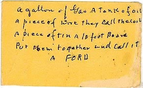
My Aunt is visiting, we were swapping horror stories about the Ford automobiles we had owned, when she suddenly said she had a handwritten Post-it note from my late Grandfather. She laminated it and keeps it in her wallet. If you can't read the shaky handwriting, it says:
a gallon of gas A Tank of oil
A piece of wire they call the coil
A piece of tin A 10 foot Board
Put them together and call it
A FORD

Technomorphia

| No Comments
I was arguing today (well, bickering actually) about whether a Mac or Wintel PC was the right tool for a particular job, and I was suddenly reminded of an extremely eccentric art history lecture I attended almost 30 years ago.

stickchart2.gif

When the lecture began, a slide very similar to this photograph was projected on the screen at the front of the hall. The lecturer asked the students if they could guess the purpose of this object, and where it originated. We could see the small seashells at some of the intersections of the sticks, eventually someone guessed correctly that it originated in the Pacific Islands near Asia. But nobody even came close to identifying the object's purpose.
Eventually the lecturer revealed that the object is a navigational map of the ocean, a Micronesian Stick Chart. The sticks represent ocean currents and the seashells represent islands, but the map's distances are not accurate on a geographic scale, they are scaled to the time it took to travel the ocean currents between the islands. Suddenly it all made sense. But then the lecturer veered off into incomprehensible, uncharted territory for us poor art students.
The lecturer asserted this object was the embodiment of "technomorphia." The object was made from the conveniently available local materials, sticks and shells, and was better suited to being carried in small seafaring boats than paper maps. He pointed out that the Micronesians had not yet learned to make paper at the time these maps were invented, but even after they learned the papermaking secret, they still preferred the Stick Charts over paper maps. Sticks and shells don't get soggy in seawater, and can be mended easily. He rambled on about technomorphic aspects of this artform, and how it developed in the cultural context of Micronesia. I didn't understand much of it, and neither did anyone else.
This particular lecturer was notorious for using incomprehensible jargon, sometimes he even made stuff up as he went along, so I always took notes and asked him for definitions after the lecture was over. I challenged him on technomorphia, and asked him to explain further. He talked about how the tools and materials available determined the forms the artwork would take. He talked at length about how technomorphia affected each separate media (i.e. printmaking, painting, photography) and how each media's expressive possibilities were achieved despite the limitations of that media. I responded, "oh, you mean, when you only have a hammer, every job looks like a nail."

A Steaming Pile of Craphound

| No Comments
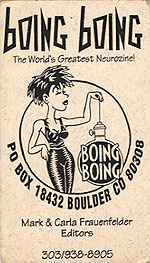
I'm observing one of the Blog world's more stupid rituals, by publicly announcing the removal of a link from my site. I have removed Boing Boing magazine from my blogroll.

boingboing.jpg

Boing Boing used to be a pretty good zine about 15 years ago, back when it was solely the product of Mark and Carla. But now it's been completely taken over by Cory Doctorow, who is a complete and utter asshole. Mark and Carla's "neurozine" is now infested by Cory's self-promotion activities, at times the site has been almost 100% advertising for Cory's new SF scribblings. Sure you have a right to use your site for self-promotion, but this is beyond the pale. Cory has his own site, I don't know why Mark let Cory take over his pet project and use it for his own purposes.
I think my main distaste for Cory comes from his unhealthy obsession with Disneyworld. I got into a flamefest with him about something he did at Disneyland and wrote about on BoingBoing. He said he gathered a large group of online acquaintances to go to Disneyland as a group, including a woman in a wheelchair. They used the handicapped woman to cut the WHOLE GROUP into the front of the line on the rides. I told him he was exploiting the woman's handicapped status for his group's personal gain. He retorted that Disneyland wants handicapped people and their friends to be able to experience Disney attractions together. I wasn't aware you could get 20 or 30 people into a single car on a roller coaster ride. He said the handicapped woman didn't mind being exploited. What a load of crap!
And there's the problem. Cory is a self-proclaimed craphound. I think he's just full of crap. There's a fine line between admiration for crappy pop culture detritus, and obsession. Cory is obsessed, he's the ultimate Comic Book Guy. I won't refer readers to the site, they have enough links. Life is too short to put up with self-important idiots like Cory.

Tax Day at the Terminal Annex

| No Comments
I used to live about 6 blocks south of the US Post Office Terminal Annex in Downtown Los Angeles. The Terminal Annex is literally the terminal location for all mail in the LA area, it's located at the conjunction of all the major highways and railroad lines in LA, and it takes incoming mail from trucks across LA. All outgoing mail ends up here before it is sent outside the city. The TA also has one unique property, it is the last place you can get a letter postmarked until midnight, since it is the only annex open until midnight. For that reason, the TA has become a traditional spot for dropping off your tax returns on April 15.
On Tax Day, streets around the TA are completely impassable for blocks in every direction. It is a scene of total pandemonium, total gridlock with hundreds of cars full of fuming, desperate late-filers. Scattered throughout the cars were roving homeless people offering to take your tax return the final blocks for a fee of $1. I saw one homeless bum on roller skates, I bet he made a lot of money. But you'd have to be a total idiot to hand your tax returns to a homeless bum, I wouldn't give it to anyone except an agent of the US Post Office.
Every year, I had to cross this massive traffic jam just to drive home, there were no alternate routes I could take to avoid the mess. I remember one year it took me over an hour to cross the four lanes of Alameda Blvd, I had to nose my car in front of crossing (but immobile) traffic. The guy I cut in front of wanted to drag me out of my car and start a fistfight because he thought I was jumping in line, I explained I lived across the street and he would have his precious spot back as soon as I crossed. I was surprised to see how much pent-up anger this crowd of late-filers had.
The Terminal Annex is no longer the terminal spot for all mail in LA. Its functions have been broken up and decentralized, moved to other annexes in the city. There are many other places that can postmark late tax returns until midnight, but the Terminal Annex is still the traditional spot for dropping off your tax return. I'm sure that tonight's LA TV news shows will be broadcasting live from Alameda Blvd in front of the Terminal Annex, just as they always do.

Not Yet Coming Attractions

| No Comments
I heard a strange new commercial pitch for a weekly TV drama, it said "4 all-new episodes coming up in only 2 weeks!" That certainly is the most original pitch I ever heard. I prefer to think of it as an announcement that the next 2 weeks would be reruns, with no new episodes until May sweeps.
What ever happened to the TV schedule? It used to be the networks would run a fall season of new episodes and then they'd replay them again as summer reruns. But somehow that changed, nowadays the scheduled shows default to reruns, and a new episode is a special event.

White Toilet Paper

| 5 Comments
Environmentalists used to take it as an item of faith that you should buy only undyed, plain toilet paper, tissues, and paper towels. Ideally you would buy unbleached papers, which would reduce some of the dioxin pollution involved in papermaking, but people just won't buy unbleached toilet paper. Our local hippie coop sells recycled unbleached paper TP with the unfortunate brand name "Second Use Recycled Toilet Paper." I insist on being the absolutely first and only user of this type of product.
The theory behind eliminating unnecessary dyes is that these papers are purchased as garbage, you buy them specifically for flushing or throwing them away. Sure you want to have a nice little colorful border pattern on your paper towels or TP as it hangs there on the dispenser, otherwise the additional dyes serve no functional purpose. But when you consider the millions of tons of these paper waste products going directly into landfills every year, it doesn't make any sense to add hundreds of tons of waste dyes along with it.
Lately I've had a hard time buying plain white paper towels and tissues. I go to the grocery store and they only have dyed "designer" Kleenex in beige or blue, and paper towels with printed borders, they have no white products at all. Apparently over the years, consumer resistance to colored kleenex and other products has been breaking down. I guess you can sell any kind of crap to people if you introduce it gradually.
It's not hard to find TP in white, as long as you want double or triple-roll 12 packs. I don't know where to store it all. I bought a Northern double-roll 6 pack today because it was the smallest the store had. When I got to the checkout, the checker said it was only 10 cents more to get the 12 pack of double rolls, I should swap. So I did. But I draw the line at triple-rolls.

Scary FBI Web Searches

| 5 Comments
I frequently review my referrers log, to see who is sending hits to my page. Occasionally I see something exceptionally strange. Currently my top referrer for April is www.iaea.org, which makes no sense because there are no links to any site on their page. I've seen this sort of thing before and I always assumed it was a DNS glitch misrouting links to my page.
Today, I just saw the most chilling entry in my referrer log. I tried to check the site but it is obviously firewalled from the regular internet. Here is the URL, read it and be afraid, be very afraid:
http://homeland.fbi.gov/Watchlists/suspect/view.jsp?record=751658
Think about that for a second. If the FBI is using sequential record numbers, they have computerized files on over 750,000 people, and it appears they're monitoring me. Also consider, we have no idea how high the record numbers go, there could be millions of "suspects."
Update: In the comments, it was suggested that the URL came from a web browser that fakes the referrer. I never heard of such a thing, but I figured it was likely to be a dumb prank like this.

BlogTV: Rikachan's Makeover

| No Comments
BlogTV is back on the air, presenting the latest cultural trivialities from Japanese TV news. I apologize for the delay in presenting new videos, but I had some major wiring problems which is the subject of another story at some other time. I've improved the signal quality and the online video quality is better, so perhaps the delay was worthwhile.
Today's subject is the cute little children's doll Rikachan. This video from FujiTV News is 4 minutes and subtitled in Japanese.
Get QuickTime5
Can't see BlogTV?
Click Here.

Rikachan was created in 1967, in reaction to American toys like Barbie. It was believed that the leggy, busty blonde teenage image of Barbie might not be suitable for young Japanese childrens' self-image. A younger, shorter, darker-haired version of Barbie was created exclusively for the Japanese market, and it's been widely analyzed as a cultural phenomenon, just as Barbie has. But that is not the subject of this video.
In a fashionable Shibuya art gallery, women and children are delighted with the new exhibition of photographs of Rika. We quickly get a review of the original Rika as she first appeared in 1967, then we see the new photographs. Rika has been given a makeover, dressed up and coiffed by fashion designers, and photographed by a fashion photographer in glamorous settings. This job must have been both a photographers' dream and his worst nightmare. The model is completely pliable, you can cut her hair in radical designs and if you don't like it, throw her away and get a new one. But sewing tiny high-fashion dresses and working with tiny polyester hair must have been extremely difficult for the stylists. The photographer obviously knows a few special effects tricks, he's used "forced perspective" in some photos to make Rika look like a normal size human against a real background scene. We see the photographer shooting Rika against some bushes, he repositions the model and declares that balance is the most important aesthetic element of a picture. Next we see him shooting a row of 4 Rikas standing up on their own, a gust of wind comes along and they fall flat on their face. Yes, balance is definitely the most important element. You can see that working with inanimate models has its ups and downs.
But of course this activity all must have a commercial purpose. A new glamour edition of Rika-chan modeled after the fashion shoot is now on sale, only 7000 Yen ($60). Rika-chan also has released her own perfume, just like any idol that wants to cash in on her fame.
In closing, a newswoman compares two Rika-chan dolls, one is an original 1967 model, the other is the current model. She notes that the new model is blonder, taller, leggier, and with a smaller face. These are all the properties the original Rika-chan doll was designed to avoid, now Rika-chan has come full circle and become just like Barbie.

About this Archive

This page is an archive of entries from April 2003 listed from newest to oldest.

March 2003 is the previous archive.

May 2003 is the next archive.

Find recent content on the main index or look in the archives to find all content.

Archives

Pages

Powered by Movable Type 4.32-en