My favorite landscape spot is a called "The Palisades," I go there occasionally to take photographs, it's especially beautiful in autumn, you can view the fall colors in the forests growing over stone cliffs next to the river. Here's a fall photo of The Palisades in my special antique photochemistry printing method.
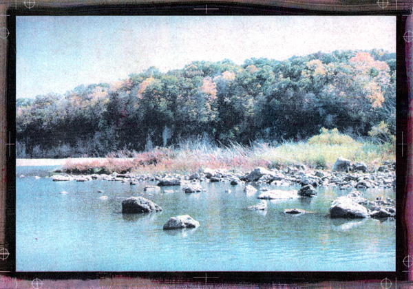
I use an antique photo printing method, it's long been abandoned since it is very time-consuming, inaccurate and prone to failure. And this print was one of my failures. Each color of cyan, magenta, yellow, and black requires a layer of pigment emulsion, painted on the paper by hand. Each color is applied, printed, washed, and dried before the next color can be applied. Sometimes each color must be printed multiple times, I think this print has about 7 or 8 layers. This can take days.
And there's the problem, one error in one layer can ruin days of work. Sometimes the error can't be seen until all the layers are printed. This print had a problem with magenta, the magenta emulsion is the most difficult to get right, it's almost always the problem. This print had a faint overall magenta stain that I couldn't recover. It was quite a disappointment as I thought I got the color right except for that faint pinkish tint.
But today, I was going through my prints and it occurred to me, I should scan and color correct it in Photoshop and see how good the color was after removing the magenta. It won't fix the original print, but I could see how it might have worked without that one error.
This color-corrected scan works pretty well, if I do say so myself. The printing method isn't highly detailed, it has a scratchy, textured look that some people compare to an aquatint. Alas, most of that texture can't be seen in this scan, only in the original print.
I like to leave the margins of these prints exposed, people always tell me how they like seeing the brushwork at the edges of the print, it shows that the work is clearly handmade. But I like seeing the registration marks, I'm proud of them. It isn't easy to keep clear registration marks aligned through 7 or 8 layers.
Overall, the color worked well, except for the sky which was a little too pale. There's a reddish patch in the middle which represents a patch of red shrubs, you can't quite make out the shapes but that color is right. The green and yellow foliage in the trees have the right colors, and the grey stone wall is a proper neutral grey (it usually looks blue in the shadowed sunlight). I'm pleased with it, I didn't pick this scene because it was such a great photo (it isn't really) but because it would be a challenge to capture all these diverse color conditions in this inaccurate printing process. It was a good experiment, I was pleased with the results, even if it is far from perfect.
This sort of printing is known in the photo world as an "alternate process." This process is extremely rare, very few artists still use it for color printing. I took one of my best color prints to a local gallery, prints of this type would generally sell for a minimum of $1000 to $1500, they offered to sell them for $250 with a 55% gallery commission. Sheesh!
Update: I decided I should put up a copy of the original uncorrected print, so you can see how bad the magenta stain was. Click the thumbnail below to see an enlargement.

Leave a comment