Recently in Art Category

1974: Broken Glass

| No Comments
Polaroid SX-70 print, circa 1974.

Broken-Glass.jpg

Assorted Scissors

| No Comments
Scissors.jpg

I have a lot of scissors. I put a few of them on my scanner, here they are from top to bottom.

Long scissors. Just over 9 inches long, with a 5.5 inch cutting blade. This scissors is very hard to use.

Heavy scissors. This scissors had a hard working life. It is rusty and corroded, and is too beat up to use. The side is stamped "Richards of Sheffield."

Fiskars. Good general purpose scissors. Easy to use, I use it a lot.

Hair scissors. I don't know why I have this, I wouldn't trim my own hair.

Surgical Scissors. Very sharp and good for small, accurate cutting. I use this scissors the most.

Polaroids: 1973~75

| 1 Comment
I found some dusty old SX-70 prints in my files. They're in poor condition and were photographed sometime between 1973 to 1975. The first two are photographs of the Indianapolis 500. I didn't notice until I scanned the first photo, you can see the Goodyear Blimp. That second shot has a nice pan and motion blur, that was really hard to do with the SX-70.

Indy500A.jpg

Indy500B.jpg

The next image had some cracks in the emulsion, I tried to fix it a little, but I left most of them unretouched. I'm finding out that SX-70 prints were not as indestructible as Polaroid claimed. But the subtle colors in the sky are pretty good.

Trees.jpg

I always liked the harsh look of the Polaroid Flash Bar, but they were really expensive. I liked using them at night, so the nearby objects were brightly lit, and the illumination quickly drops with distance.

Curb.jpg

1993: Sphere Study

| No Comments
If you study drawing, you do a lot of basic studies. Drawing a sphere is a classic study, you must get the lighting and shadows right in order to portray the volume convincingly. But studies can be terribly boring, so you try something different. Anything different. 

I did a lot of studies like this when I was doing a portraiture project, I've posted other drawings from this series and you can probably see what I was working out. This was a particularly good, rough, scribbly sketch, from early in the series. This 9 inch square drawing looks like chalk or charcoal, it's old and starting to get smeared and a little soft, but the whole drawing was soft and smeary to start with. 

Sphere-charcoal.jpg

1995: Tiny Portrait

| No Comments
I found this tiny portrait on a page with other portrait studies, I must have drawn it around 1995. It's only about the size of a thumbprint and is greatly enlarged here. I must have used a Japanese calligraphy brush with a fine point. It's hard to control that kind of brush at this scale, but I like the coarse strokes mixed with some sweeping, fast lines,

tiny-portrait.jpg

2004: Koi

| No Comments
Here is another experimental print in my antique photochemistry process, I think I made it around 2004. Like a lot of prints I make, I thought this one was a failure. It certainly didn't turn out the way I intended. But I decided it was not such a failure after all. This is a very large print, 11x16 inches, the largest print I ever attempted in this media.

Koi-Print600.jpg

I took this photo with a cheap Fuji disposable 35mm camera, this is the moat at Goryoukaku Fortress in Hakodate, Japan. I scanned the little 5x7 inch print and made digital color separations, that's where I made the error. I was experimenting with CMYK "undercolor removal" for this color separation. When you have a dark, neutral color, it usually has a large amount of cyan, magenta, and yellow in it, in addition to black. UCR removes those "undercolors" and replaces them with black. But it was a failed experiment, the colors all went too much towards black, which covered up a lot of the brighter colors. This process is fairly high contrast, it has trouble conveying subtle colors. But I did manage to capture some nice, smooth tonal changes that are normally beyond the range of this process. There is a subtle change of light color across the top, as the green lotus pads float in in the blue water. But the darker tones in the left corner went to almost totally black, they were actually dark blue. I think this UCR method is not the way to go for this process, most people only print CMY and don't print the black at all. This print might have done better with a lighter black layer, but it's too late to redo the films now. The colors that do appear are subtle and generally faithful to the original (even if they're a little faint).

But I decided I liked the results in this print anyway, even if it wasn't what I wanted. The darkest blacks are somewhat blue-black. And even the black seems to work with this image, just as it is. The high contrast brings out the details in the rippling patterns of the water, and the structure of the lotus pads. And there's a lot of detail in a print this big. Here's a detail from the print, slightly enlarged.

Koi-Detail.jpg

If you look closely, you can see white lotus flowers in the upper left and right corners. If you look very closely, you can see they have a faint yellow center. And the koi swimming in the foreground has an orangy salmon color. The dark blue-black water helps the fish stand out. It's hard to get subtle color for both strong colors and faint pastels. But this seems to work somewhat on both ends of the scale. Registration between layers was very good in this print, so there is good detail here (if you can believe that). This process is notorious for lack of detail, that's part of its look. Overall, there are more successes than failures in this print. But I'd sure like to print it again, with better negatives.

Update: I found another print of this image, it's small enough to fit on my scanner so I can get improved color accuracy. It has a lighter black negative and doesn't use UCR, so the midrange, bright colors are more apparent. And you can see fairly good detail in the lower left corner, that wasn't visible in the other print. But this separation is bad too, you can see too much black in the light areas in the upper right. The midrange tones are pretty good but the light end lost detail. I think this was the separation that inspired me to see if UCR would do better. This separation still isn't right, but it's closer than the other one. I can do almost any variation of color separations to get any tonal scale I want, but it can get complex. Ideally I would make 8 negatives, two for each CMYK color, one for the high tones and one for the low tones.

Koi-Light-Proof.jpg

1977: More Color Transfers

| No Comments
I photographed more of my old color transfer prints. These prints are larger, this one is 11x14 inches. There are at least 7 transfers on this print, but I can't tell exactly.

ColorTransfer3.jpg

This next print about 11x16 inches, I'm showing it at a smaller scale than the previous picture. This print is less complex with just one primary image. It seems to be a graph of some kind. But the ragged patches of flat, pale color from other prints makes this look more like a painting.

ColorTransfer2.jpg


Enhanced by Zemanta

1977: Color Transfer

| No Comments
I found a cache of my ancient artwork from the 1970s, when I was an art student. I've been scanning and posting a few of them. I thought this was an interesting piece of collage, it's a "color transfer" Solvent is applied to magazine photos, the photo is placed against the paper, and the back of the photo is burnished to transfer the image. I think in this one, the solvent was acrylic medium. It has a beautiful texture and the colors are fairly strong. Color transfers tend to have weak, transparent colors, it's hard to transfer much of the ink.

Astronaut-color-transfer.jpg

I found several of these prints, but this is the only one small enough to fit on my scanner, it's about 8 inches square. I might post the other images later if I can get a good reproduction. These seem to be hard to capture.

I remember fiddling with color transfer a bit, sometime around '77. This is what we used to do when we didn't have photoshop. It is kind of like monoprinting, but you just have magazine photos as your source. You can manipulate the texture and depth of the transfer, but it's pretty random. I guess we thought we were all Rauschenbergs, he used color transfer, but he had a professional printmaking atelier to do them properly. This color transfer process was popular around the printmaking department at the U of Iowa, it was so cheap and easy that a lot of students worked with it. But now it's pretty much a lost art.

1976: Life Drawing 202

| No Comments
Sometimes when people scoff at my draftsmanship and drawing ability, I need some evidence to show that I actually have some talent. Usually the person scoffing is me, artists are their own harshest critics. I recently found a nice "academic drawing" of the type I usually avoided because it was so difficult. I drew this probably sometime late in my sophomore year, near the end of two years of life drawing classes. The pencil drawing is so faint that it was nearly impossible to photograph, so be sure to click on the pic and an enlargement will pop up.

PencilDrawingNude.jpg

1974: My First Gig

| No Comments
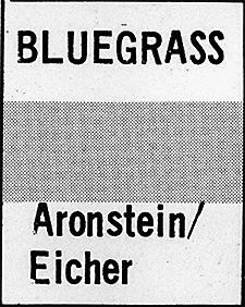
I discovered a copy of my very first commercial gig in graphic design, produced when I was 16 years old. My older sister had a college radio show at WHPK, she came back home for winter break and commissioned me to produce a low budget poster. I put this poster together using the pasteup equipment at my high school newspaper. The remarkable thing about this poster is that it was all done by hand on a paste-up board, no computers, no digital typesetting. You can click on the poster to see a larger image pop up.

WHPK-Poster-Large.jpg

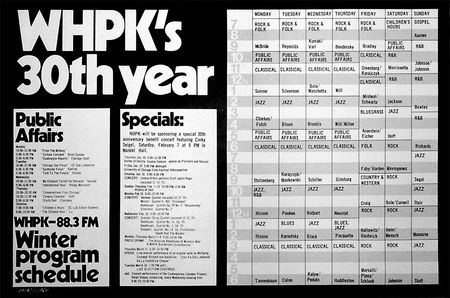
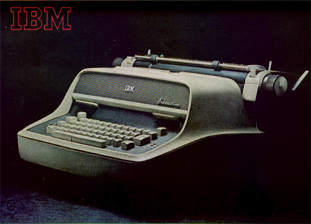
This poster was produced using Chartpak type, rolls of tiny "hairline" tape, wax adhesive, some darkroom work, and an IBM Model C Executive typewriter. The Model C was a wonderful typewriter, it could do proportional spacing and if you used a carbon ribbon, it had almost typeset quality. Almost. Someone donated an old beat up Model C to our school, it was obsoleted when the Selectric was released. Our Model C's output was sometimes shaky, but it was the best we could get for free. I had a hard time finding a decent pic of the old Model C Executive, it was released in 1959 so it's way before the internet. 

IBM-Model-C-Exec-Typewriter.jpg

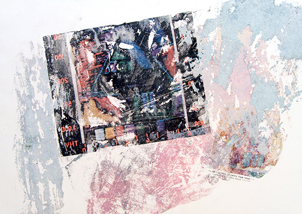
The Model C's typesetting could be frustrating, particularly since it didn't have very good vertical precision. The sorts of things the Model C did would be intolerable to anyone using modern computer design programs. Here's a good example. I scanned a closeup of the schedule, you can see how hard it was to align the type and have consistent leading (the vertical space between lines).

Leading.jpg

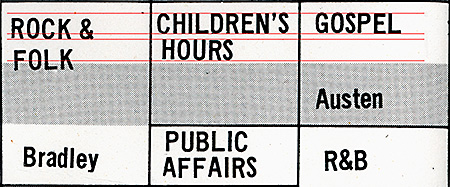
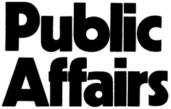
I marked the correct type baselines in red, you can see how "ROCK & FOLK" does not line up right. Even the best typesetting (in the "Children's Hour") is kind of shaky, with a slight slant. Some of this type is slightly crooked because it was cut out and glued in place. This is how the grid system started, you had to lay down small pieces of type into a layout and everything would be hopelessly out of alignment if you didn't line everything up on the grid. But even crooked type can be made worse, the letters in the word "Bradley" keep getting lower and lower, it looks like the paper was slipping in the typewriter. And the A in Public Affairs is chipped off. Sometimes the letters would flake off, the carbon ribbon printing was very delicate. We worked for hours over these pasteups, moving things around and reworking them. It's a miracle things stay lined up at all.

But I'm not taking responsibility for the poor type even though this is my poster, I think my sister did most of the typing while I worked on the headline type and layout. So I'll get even with her and release a skeleton from her closet: she had a bluegrass music college radio show. Today, she will deny she ever had any interest in bluegrass music and was an avid bluegrass musician. But I have the evidence.

WHPK-Bluegrass-with-Carol.jpg

You can see another common layout problem in the upper left corner of that box, the corner is open. All the lines were produced with rolls of Chartpak Graphic Tape. This is hairline width, I think it's 0.25 points. The tiny tapes were terribly difficult to work with, you had to stretch the tapes over the layout board, align it to the faint blue grid lines, carefully press them into the paper, and cut the ends with an X-Acto knife. Corners were especially difficult. If the layout board was mishandled, the tapes could pull apart and leave open corners.

But enough about the problems, there are some good features to this design as well. The headlines in Kabel Bold type were all done by hand with Chartpak "rub-on" transfer type. The letters came on plastic sheets, you moved the sheet into position on paper and rubbed the plastic sheet with a blunt tip "burnisher" to transfer the letter onto your paper. It was hard to make good rub-on type, but this is an excellent job. Wow, look at that tight kerning! And it was all done by eye.

WHPK-Public-Affairs.jpg

I liked to put the type on clear acetate and then enlarge it in the darkroom. I could enlarge type to whatever size I needed, even advanced phototypesetting came only in fixed sizes. Nowadays we take resizing type for granted, we just use the computer and drag the type block until it's the size we want. But back in the 1970s, that meant printing on photo paper in a darkroom and developing it in trays of chemicals.

WHPK-Zebras.jpgThe core idea of this poster was a chronological layout, using gray stripes to guide the eye across the grid. Today this design is known as "zebra stripes," it's very common, it is even used on computer screens to display long file lists. I got the idea from "green bar" computer paper, it had green zebra stripes to guide your eyes across 14 inch wide paper.

We called the little graphic device on the left a "puppy." I made design elements like this for our high school newspaper. One day I gave my finished artwork to a guy working on the newspaper layout and he said, "slap that puppy on there!" So that name kind of stuck to it.

But I digress. That artwork is deceptively complex, it had to be produced on 3 different layout sheets. Each sheet had to align precisely with the others and you could not see how it would look until the layers of artwork were etched into a printing plate. 

The dark bars and dark numbers were laid out on one sheet. Then a second sheet was an overlay with the type that would be "knocked out," putting the white type in the dark bars. The camera operator who turned this artwork into a printing plate had several steps to perform. The layers were photographed on separate negatives at full size. Then the films were overlaid and the numbers "subtracted" from the bars on the other sheet, and halftone dots added to make it gray. Then that negative was positioned on the main poster design on the third layout sheet. That sounds like a lot of work, it was, but we did this all the time with manual layouts. So when you use Photoshop and you see confusing commands like "Subtract Layer," this is where that stuff all came from. It was standard graphic arts technique.

The final step was to print the poster. I used the local print shop that we used for our high school newspaper. They had a beautiful Miele sheet-fed offset press that was probably manufactured in the 1920s. The poster was designed to fit exactly twice in the maximum paper size of this press, so the sheets could be chopped in half. I picked a glossy, stiff poster paper for this job.

I went back to the print shop to see if the printing plates worked as I had designed them. Surprisingly, they had already printed the whole job, but on the wrong paper, on the wrong press. But the posters looked great, I took one sheet as a proof. They printed on much larger sheets on a more expensive press than I could afford, they upgraded my job for free. But the larger press used bigger sheets of paper, that's why I targeted the smaller press. Now the posters had large white edges that would all have to be chopped off, 5 precise cuts in the big cutting machine instead of one. I didn't care much about that, they didn't charge extra for the cutting, but it was just another step where errors could occur. I loved the thick, matte paper they used, I told them to not reprint the job on the right paper, I'd take the job as-is. But when I came back the next day, they had reprinted the whole job on the glossy paper and discarded the matte version. So this press proof is the only remaining matte version.

The final press run was printed, cut, and wrapped in brown butcher-paper bundles. The whole job was a stack of paper about two feet high. It was amazingly heavy. I loaded the bundles into my sister's trunk so she could drive them back to college, I could see the rear end of her car sag slightly under the weight. She told me that everyone at WHPK loved the poster. I suspected they liked it mostly because the design was so elaborate for such a low budget. Most of the money went to the printer. I can't remember the exact budget, but I vaguely recall the printing cost about $100 and I think I made about $25 for myself. The cost of materials couldn't be more than about $3, but I don't recall exactly.

Well that was quite a trip down memory lane. It is amazing how much I remember about this specific job, considering it was 37 years ago. And then I realize, I've been working in print and design for over 37 years! I often think about how many obscure technical skills were required to manually produce these projects, and how those tools and methods are considered a lost art in the modern digital design world. But these primitive skills were the foundation of my lifetime career in graphic design and printing. 

Printing and design has changed so much over the years, but I can never really get far from my roots. Coincidentally, I now live next door to the old print shop site. They disbanded long ago, now it's a hardware store. I am writing this article about 150 feet from where this poster was printed.

1975: 3M VQC Copier Art

| No Comments
The photocopier was invented for graphic arts, so when great technical improvements occurred in the 1960s and 70s, artists were immediately attracted to copiers as a graphic arts medium. One of the pioneers of copier art was Wallace Berman, he worked with a wet process known as Verifax. Berman's work was influential, but complex wet processes are barely an improvement over photo darkroom processes. 

Copiers were designed for reproducing text or line drawings, the high contrast copies made it difficult to reproduce photographs or continuous tone artwork. But in the 1970s, a photographic quality copier was in widely distributed, the 3M VQC Copier. Artists loved it, a coin operated VQC copier was available at a local public library, artists like me lined up to use it for hours at a time. 

One of the great features of the VQC is that you could run copies through multiple times, overlaying images. Each pass through the copier had a different tonal quality, and you could change copier settings for more effects. You could also draw on the copier paper with markers or silverpoint before printing on it, the copier toner would not adhere to the drawing. Direct manipulation of the copy process was easy, but the results were unpredictable. 

Here's an image I made sometime around 1975. It's a copy of a bold graphic poster from Japan, run through the copier twice. The second impression is gray, offset from the first. If this artwork turned out well, it was probably because of the graphic artist who made the original poster.

CopierArt1975.gif

Copier art was a revolutionary technique in modern mechanical reproduction. Some graphic artists started using copiers to enlarge images, rather than using projector systems like the Lucygraph. Some artists even turned copiers on their side and used them as cameras, foreshadowing the digital camera. But in the Postmodernist aesthetic, copiers were used to produce flat images, reducing the world to two dimensions, stamped out repetitively.

Here's another copier artwork I made. It's taken directly from the VQC copier repairman's test image. This is just an intermediate stage of preparation for the final artwork, made by cutting up copies and gluing them together. You can see the image is produced with halftone dots, It's line art so it's not really photographic and not much of a challenge for the VQC. But it's easy to chop up any old image and change the meaning by multiplying it. You might be able to tell the eyes on the left have more detail than the eyes on the right (a second generation copy). You could manipulate detail and add noise by making multiple generations. 

CopierArt1975.gif 

Here's the final artwork, run through the copier over and over, in different orientations. Each generation added more grainy noise. I thought this gave the final print some richness that was lacking in the original line art.

CopierArt1975.gif

Each of these images are the width of a sheet of copier paper. I wish I could reproduce them larger, so you could see the rich detail, but alas, I can only provide thumbnails, to prevent my images from being pirated. Note that these images (like all original content on my blog) are copyrighted: Copyright © Charles Eicher 1975-2011.

It wasn't a great leap from the copier artists of the 1970s to the desktop publishing revolution of the 1980s. But perhaps some of the fun went out of the medium. LaserWriters with digital input always gave you the exact, precise results. You never knew quite what you were going to get with the old analog copiers like the VQC. 

1976: Life Drawing 101

| No Comments
I was going through some folios of old artwork and found this little sketch from my oldest Life Drawing classes. This must date to around 1976. I was a total rookie at drawing, this is kind of embarrassing, but I can see some good qualities here. This sort of artwork would be considered "juvenilia," work done as a young artist who hadn't quite figured out what he's doing.

Nude-in-Wicker-Chair.jpg

Now obviously I'm struggling here with the proportions of the leg, there are some erasures and I probably had it better before I erased it. The leg and torso are presented flat in the picture plane, so I did have some sort of idea of what I was trying to do with this drawing. The left leg also has problems, but it is shaded in a way that pushes it back from the picture plane. You can see it took me a couple of tries to get the round shape of the wicker chair, but it's shaded rather nicely. There are two or three different pencil hardnesses in use here.

But I am rather more pleased with the torso and shoulder, the proportions are right and it forms the front plane with the leg. It's hard to indicate the roundness of forms when you draw in these sketchy strokes, executed so rapidly. But the sketchy strokes work well when just suggesting the shape of a shoulder blade, the shadow under the upper arm, or the shape of the hips and buttocks. The round curves in the back of the chair pull the picture inward, while the square front of the chair helps establish the front plane of the model.

The problem with this sort of life drawing is that the poses are only a few minutes, so you don't have time to work everything out. The classes are designed to help you work out your issues with proportion and lighting, but you can only work on a couple of things in a single drawing. It's almost impossible to get it all right.

This drawing is about six inches across, in the corner of a large 18 x 24 inch sheet of paper. The full page is taken up by an unfinished sketch in large, rough, black chalk, working out the composition. It is obviously abandoned but has the same composition as the sketch. I can tell I did a quick chalk sketch but didn't like it, and didn't want to waste the whole sheet of paper, so I did this little sketch in the corner.

I am not an artist with natural draftsmanship skills, it's hard work developing those skills. I still have poor draftsmanship, which is pathetic because I have a BFA degree in Drawing and Painting. Obviously being unable to draw well is not an obstacle to an art degree in Drawing. I recently did some Life Drawing studio sessions and I can tell I still struggle with the same problems of body proportion and how to convincingly portray it. Now I have other qualities that help my drawing rise above the level of just another poor draftsman, and I can see some faint impressions of my current drawing methods in this old drawing. That's why artists sometimes keep juvenilia, to compare it to their current work, and see where they came from.

It's interesting to compare to what other work I was doing in art school at that time. I might have been at the cutting edge of computer graphics at the time, but I still had to take the basic Life Drawing classes, like every art student. Today, every art student wants to do computer graphics, but I've done that. Now I'd rather do Life Drawing.

Steven Holl: Architect from Hell

| 1 Comment
I am outraged that the University of Iowa has, for a second time, selected architect Steven Holl to design a new building on the Arts Campus. Holl was previously commissioned to design the Art Building West to replace the old art building that was heavily damaged in floods in 1993. However, Holl disregarded the primary design goal, to build above the flood plain. In fact, he built it even lower than the previous flood-damaged buildings. He could easily have built the building a few feet uphill from its present site, avoiding the flood risk, but Holl fell in love with a pond on the site, and built the building at the level of the pond, well below the level of the flood plain. And of course the building was flooded and seriously damaged during the floods of June 2008. Now Holl is commissioned to build another Art Department building adjacent to the old building, just uphill, where he should have built the first building. Here is a photo of the old building during the flood, taken from the position of the new building's site, notice that the new site is above the flood waters.

ABW.jpg

I attended the opening of Art Building West in 2006 and met Steven Holl. I intended to produce a full review of the building's architecture and the architect, but I was so livid at the outrageous problems with the building, I decided to wait until I cooled off before writing my scathing review. But it has been years since the opening, and now I am angrier than ever. So I will have to write my review. It will take some effort to write it clearly when I am so angry at Holl, but let me preview the most salient point. Holl's distinctive architectural features, his staircases, are a hazard to the occupants of the building. Before the new Art Building had even opened, one visitor was seriously injured, falling down a staircase because it did not conform to building codes. The building will continue to injure people for as long as it is in use. Fortunately, the building has not been used since the 2008 floods. I am outraged that the University of Iowa would, once again, hire this architect to design another building. No doubt he will design another similar building, with features that are designed to please the architect, but disregard the safety of the building's occupants.

Self Portrait 1995

| 1 Comment
Sometimes when I haven't posted anything for a while, I go dig through my archives and pull out something I haven't seen for years. Here's a quick self-portrait study I did in a drawing class, I think it was in 1995. This drawing is 11 by 14 inches and executed in black and white chalk, grey pastels, and lots and lots of erasure. The drawing is so soft it could easily be damaged just by wiping a finger across it, so I figured I should scan it to keep a backup.

Self-Portrait-1995.jpg

Palisades

| No Comments
My favorite landscape spot is a called "The Palisades," I go there occasionally to take photographs, it's especially beautiful in autumn, you can view the fall colors in the forests growing over stone cliffs next to the river. Here's a fall photo of The Palisades in my special antique photochemistry printing method.


I use an antique photo printing method, it's long been abandoned since it is very time-consuming, inaccurate and prone to failure. And this print was one of my failures. Each color of cyan, magenta, yellow, and black requires a layer of pigment emulsion, painted on the paper by hand. Each color is applied, printed, washed, and dried before the next color can be applied. Sometimes each color must be printed multiple times, I think this print has about 7 or 8 layers. This can take days.
And there's the problem, one error in one layer can ruin days of work. Sometimes the error can't be seen until all the layers are printed. This print had a problem with magenta, the magenta emulsion is the most difficult to get right, it's almost always the problem. This print had a faint overall magenta stain that I couldn't recover. It was quite a disappointment as I thought I got the color right except for that faint pinkish tint.
But today, I was going through my prints and it occurred to me, I should scan and color correct it in Photoshop and see how good the color was after removing the magenta. It won't fix the original print, but I could see how it might have worked without that one error.
This color-corrected scan works pretty well, if I do say so myself. The printing method isn't highly detailed, it has a scratchy, textured look that some people compare to an aquatint. Alas, most of that texture can't be seen in this scan, only in the original print.
I like to leave the margins of these prints exposed, people always tell me how they like seeing the brushwork at the edges of the print, it shows that the work is clearly handmade. But I like seeing the registration marks, I'm proud of them. It isn't easy to keep clear registration marks aligned through 7 or 8 layers.
Overall, the color worked well, except for the sky which was a little too pale. There's a reddish patch in the middle which represents a patch of red shrubs, you can't quite make out the shapes but that color is right. The green and yellow foliage in the trees have the right colors, and the grey stone wall is a proper neutral grey (it usually looks blue in the shadowed sunlight). I'm pleased with it, I didn't pick this scene because it was such a great photo (it isn't really) but because it would be a challenge to capture all these diverse color conditions in this inaccurate printing process. It was a good experiment, I was pleased with the results, even if it is far from perfect.
This sort of printing is known in the photo world as an "alternate process." This process is extremely rare, very few artists still use it for color printing. I took one of my best color prints to a local gallery, prints of this type would generally sell for a minimum of $1000 to $1500, they offered to sell them for $250 with a 55% gallery commission. Sheesh!
Update: I decided I should put up a copy of the original uncorrected print, so you can see how bad the magenta stain was. Click the thumbnail below to see an enlargement.

R.I.P. Gelsy Verna

| 1 Comment
I was shocked and saddened to learn of the untimely death of Gelsy Verna. She was my favorite painting teacher, she taught me how to really paint. I was particularly shocked because I am working on some watercolors, I noticed how much they owed to what Gelsy taught me, I had a passing thought that I wanted to show them to her. Then the next day I heard she had passed away.
I still vividly remember when I first met Gelsy. I came back to art school to finish my long-abandoned BFA, and to my dismay, I found I had to take 4 semesters of oil painting, it would take 2 years. I'd already taken Painting 1, but that was the course that got me kicked out of art school 20 years earlier, so now I'm back with the freshmen starting from square one. I think this was Gelsy's first teaching position, and her first semester at the U of Iowa.
Gelsy gave us our first assignment, she set up a crazy still life with strange lighting and told us to paint anything we'd like, but only using two colors, yellow and black. I thought this was an exceptionally strange assignment, but I had some top quality artist's-grade oil pigments so I started mixing colors and painted away. But the oddest thing happened. All the other students were mixing yellow and black to get a range of greenish tones, but my pigments would not make a green. Gelsy was puzzled and tried to mix my paints to get the greens, but she couldn't do it either. This was the whole point of the assignment, to learn how to produce the greenish blacks. We both concluded that the black+yellow=green trick only worked with cheaper student grade pigments. I still have that painting, I couldn't bear to throw it out, no matter how bad it is.
Gelsy loved to give strange assignments that made us explore how painting worked. I remember once she had us do a small figure painting with special conditions: black and white pigments only, in a darkened studio with dim light on the model, to be painted in 5 minutes. Gelsy loved my painting, but I'm used to these quick assignments from drawing classes. This style of painting is just the opposite of what most painters do, traditionally you don't use black oil paint at all, you mix a black from colors. But Gelsy really taught me about the use of black pigments, I used to joke with her that she got more range from black than I got out of the rest of the spectrum. So it was probably not surprising that I became more interested in black and white painting, in my final semester in painting class I completely eliminated color and just painted in black and white tempera paint.
Gelsy also ran the Senior Seminar every painting major had to complete in their last semester in school. I think junior professors were drafted into this teaching assignment, the newest professors brought fresh, outside influences to the school. The class helped students prepare for their BFA Clearance, where a committee of professors signed off on your degree. We spent our last semester critiquing each others work (always a dodgy proposition with a bunch of painters with senioritis) and preparing for our presentations. We also spent a lot of time arguing over theories and artists, I've previously written about our misadventures in that class.
I was nervous facing the BFA Committee, I'd worked hard but it was still possible to be rejected and not get your degree. The committee was stacked against me with my harshest critics. One of the professors was instrumental in me being kicked out of art school back in the 1970s, I always hoped he did not remember me from back then. Even if he didn't remember me, he hated me anyway. Another professor was the painter I wanted to study with, but she didn't like me or my painting. Gelsy was on the committee, I hoped she would be my advocate since she knew and understood my work. I displayed highlights of my work, was questioned about my methods and my results. Oddly enough, my photo printmaking seemed to win over the painters and put my work into context. I left the room, the committee deliberated for a few minutes while viewing my work, then delivered the signed statement approving my BFA. Congratulations, you are now an artist, now go away. No you can't do your MFA here, we don't take our own BFA graduates into our MFA program. You have to go somewhere else to get different influences.
Gelsy had an MFA from the Art Institute of Chicago, she always tried to introduce us to the Chicago scene. I encouraged her to stay and teach at Iowa, mostly for the selfish reason that I wanted to take more of her classes. She did stay here for quite a few years, and I always wondered whether or not I did her a favor by talking her into it. A couple of years after I graduated, I was in Chicago and saw her work in a gallery, I wondered what she was up to. I figured she'd moved on, so I asked the gallery if they had her contact information. The receptionist said she couldn't give out that information but they could pass along a message, so I left my number. About 10 minutes later, my cell phone rang and there was Gelsy, asking me where I was. And I asked where she was, she said she was still in Iowa City, I could have looked her up in the local phone book. Oops, I should have kept in touch more.
I lost touch with Gelsy when she moved out of town, so it was a shock to hear the tragic news, the first I'd heard of her in a few years. The outpouring of grief from her students and friends, the people she affected, must be immense. Everyone loved Gelsy, she was a great teacher and painter, I was looking forward to seeing much more of her work over the years to come. But now she is gone, I feel a great loss, a great sadness. It is times like this when I wonder if there is a place for artists in this world. Gelsy tried to teach me how to find that place, but my mentor has left me alone and I despair that I will never find it.

Test Sheet

| No Comments
Most painters have a little spot next to their artwork to smear paint around and test their brush before applying it directly to the artwork. Here is the newspaper I used in my current watercolor painting setup, you can click on the picture for a larger view.


I used to oil paint with my canvas attached to the wall, so I used to wipe my brush right on the wall next to the painting. Here's a photo of what that looks like. It used to annoy me terribly when people would visit my studio and see my paintings in progress, they would be completely indifferent to my work, but they'd go up to the smears on the wall and say, "ooh, what is that?"
But lately I've begun to see what attracts people to these smears. It's an accidental painting done with absolutely no painting intention. It's just a test sheet to see how my brush is loaded and how dark and transparent the pigment is, it's applied over previous test brushstrokes in roughly the same layering as my current painting. So it contains many of the same decisions I make in my current painting, but completely stripped of any deliberate brushwork or imagery. If you think about it, that's quite Postmodernist (especially considering they just end up in the trash).
I remember seeing a video of Chinese students during the Tiananmen Square protests, painting banners with big brushes and sumi ink. They had a room full of big tables covered with fabric and large posterboards, and at the end of each table were sheets of newspapers, covered with black ink. Each sheet of paper was curled up like a little bowl. Sumi ink is thick and full of resin, so once the sheet was covered in ink and dried, it formed a waterproof bowl, and the students would fill them up with ink. I thought that was pretty clever, but I prefer using a ceramic dish.

Eye

| No Comments
Eye.jpg

I went through some old work and I found a watercolor painting that was particularly amusing. I don't remember painting this, but I must have done it around 1992. I remember I took a drawing class and was assigned to do endless studies of cranial anatomy and the eye in particular. It's anatomically accurate enough that I can tell it's my own right eye. I must have been bored with the assignment, staring at myself in the mirror, and decided to spice things up a little. You can't tell from the scan, but the pigments are intensely bright Day-Glo fluorescent magenta and cyan. I wish you could see the original, it's almost too bright to look at.

Painting

| No Comments
I've been painting a lot lately. It's easy to set up a little watercolor painting area with just black and white pigments and a few brushes. Here's a photo of my painting area.


This painting isn't anywhere close to being finished, it has a long way to go. It's actually quite a bit darker than this photo indicates. This is one reason why I don't like to show my artwork on the internet, photos just don't capture what the paintings look like. And that's a deliberate choice. I work with a lot of chalky flat textures against shiny or matte black layers. Some layers are thin and transparent, and build up density slowly, some are opaque. It is almost impossible to see my paintings' best effects without looking at the original surface. Photos just don't work.
Lately I've been thinking about a quip by my favorite painter, Jean Dubuffet, he said, "the problem of painting is how to cover a surface in an interesting manner." I think he was poking fun at painters when he said that. It's easy to make an interesting surface, but what are you going to do with it? I never quite figure that out until I'm halfway through the painting. Sometimes I never figure it out.
One challenge I set for myself was to try to work watercolor media as hard as oil paints. It's a lot easier to control transparent effects in oils, but water media tends to drag up the layer below it, if you paint white over black, you just get a murky, chalky grey. But I like those tones, so I paint layer after layer, building up tone slowly.
I like to tape my paper down to a board, since it buckles and swells when water hits it, but becomes taut and flat once it dries. It's a lot easier to paint on the same paper over and over if it doesn't buckle and warp. Then when you pull up the tape, the painting is framed with a nice clean white edge. A serious watercolorist would soak the paper and glue it down with paper tape while it's still wet, then it would really be stretched flat. But that's too much trouble and you have to cut the image out, leaving no margins around the image.
I also found my old "fudemaki," that's a Japanese "brush wrap." It's full of nice calligraphy brushes I bought in Japan a long time ago. Most of these brushes are so nice I have never used them, I was saving them for a special occasion. Then I figured, what the hell, I guess this is what I was saving them for. My particular favorite brush is the huge stubby brush at the bottom of the picture, I did most of this painting with this brush, using dry brush techniques. The brush is a little too large for a piece of paper this small, but I'll make it work anyway.
I also have a bunch of cheap writing brushes, most of them have "300 Yen" tags, so I paid around $2.60. At the top of the group of 3 brushes in the picture is a crappy brush I bought locally at Dick Blick for over $6, it has half the hair and none of the great shape of the two 300Y brushes next to it. That crappy Dick Blick brush was what inspired me to go hunt for my best brushes, I knew I had lots of better brushes sitting in a box somewhere.
Also I found a cache of really good Holbein watercolors, some of the pigments I use in photographic printmaking. They're really quite good. I used to make huge black and white paintings using cheap tempera paint, but this is much better.
So now that I've got my better materials all set up, I feel like I'm actually doing some good painting. I'm actually finding directions to go in each painting, and relatively quickly. One of my artist friends looked at my recent paintings, and encouraged me by telling me, 'now you have to do a whole bunch more of them!" So I told him a story I heard about Jean-Michel Basquiat. When he was just starting to hit big, people were lining up to buy whole shows of his paintings, but he was still only working on one painting at a time, so his output was really low. His gallery wanted more paintings, more quickly, so they offered to send an assistant over to his studio to help him prepare canvases. Basquiat could spend more time painting and less time setting up. So the assistant comes over and finds Basquiat working on one painting. He sets up a few blank canvases and tells Basquiat he is ready to help shift canvases around when he's ready to work on different paintings. But Basquiat never heard of this before, the assistant had to teach him that you could work on several paintings at once, switching between them, leaving some paintings to dry for later overpainting, coming back to them when your ideas have developed further. Suddenly Basquiat started really cranking out a lot of paintings. The gallery was very happy to have a vast supply of new works. Basquiat was raking in the dough, which only lead to his downfall.
Well when I first heard that story, I admit I was the same way. I usually worked only on one primary painting at once. So I tried working on several paintings simultaneously, it was surprisingly effective. I got a whole show of about a dozen paintings ready in just a couple of months. Of course I cranked out a lot more bad paintings too, but nobody has to see them.
So one of the reasons I post photos and other projects with my paintings, is to let people take a look at what is behind the easel. An art consultant once told me that people don't want to buy your images, they also want to buy into your backstory as an artist. I may not have the same interesting backstory as a Basquiat, but we all, as painters, have to deal with some of the same issues.

Dutch Blue, Again

| No Comments
An old, obscure article I wrote on the subject of the pigment "Dutch Blue" and lapis lazuli has suddenly become relevant again, albeit in another obscure context. I discovered some discussion on the Ancient Japan Weblog about a frescoes in a tomb dated to the 7th or 8th Century. Researchers suddenly withdrew their assertion that the blue pigment in the tomb paintings were made from lapis lazuli. This retraction caused much puzzlement amongst scholars as no reason was given, and it appears that forensic analysis has not yet been performed. My article asserted that lapis was used as a pigment in the Edo era, but there is no evidence that it was used as early as the 7th or 8th century in Japan, so its use at such an early date would have been a significant historical discovery.
I won't repost the entire obscure discussion, but I will point towards the original post at the Ancient Japan Weblog and the followup discussion on their associated forum.
If there is one thing that really burns me up, it's fraud on the Internet. This fraud by Rex Bruce and his so-called "Los Angeles Center for Digital Art" is especially heinous, as it preys upon struggling artists who seek only to expose their artwork to the world.
Today I read an announcement of an "Open Show" of digital artworks at LACDA. An Open Show is an exhibition with no restrictions, anyone can exhibit their work if they pay the entrance fee. But this announcement (I refuse to post the link) is a money-making scam by Rex Bruce.
There are real Open Exhibitions, and the fraudlent LACDA gallery even had the nerve to compare itself to the famous LA Open Call:
Every year for 50 years the L.A. Municipal Gallery has held its "Open Call" exhibit where any artist can show up with their art and an entry fee (to benefit gallery programs) and the piece is shown. The Los Angeles Center For Digital Art decided to launch an international experiment of the same nature where the artists upload images that are printed and hung by the gallery.
Okay.. this LACDA show is "of the same nature" as the LA Open Show, but it is not the same. The LA Open is a benefit show for the Barnsdall Art Park, for a modest $20 you can submit a sculpture, photo, or painting up to 5 by 5 feet, and the first 1000 entries are guaranteed to be shown. A jury of local artists picks the 10 best works in the show, and awards them a $100 cash prize. Leftover proceeds from the entry fees are used to support public arts programs, for example, children's classes at the Junior Arts Center.
But the LACDA scam is quite different. For a rather expensive $31.25, you can submit one jpeg image, which will be printed on letter-size paper and hung in the foyer of Rex Bruce's loft for 3 weeks. The "gallery" is a single room in the decrepit center of Downtown LA's Skid Row, even the Police are afraid to walk in that neighborhood. There are no prizes or awards given to exhibitors, and Rex Bruce will keep your work after the show.
There are pictures of last year's show up on the LACDA website, I have joined them in a pseudo-panorama to show as much of the exhibition as possible, without any duplication or overlap. The original photographs were copyrighted by LACDA, but I am presenting this derivative composite image under the Fair Use laws, for purposes of journalistic documentation in the public interest.

lacda_pano.jpg

I counted at least 250 images in this photo, and there are obviously more that extend beyond the edges of the picture. At $31.25 for each entry, that is a minimum of $7,800. The "gallery" is a single room, the image shows only one wall and a freestanding wall on the left that might have images on the other side, so it is possible this exhibit has 500 images, maybe more. That could be over $15,000 of profit! And Rex Bruce keeps all the money.
I decided to investigate Rex Bruce a little more, and unfortunately, this isn't the worst of the scam. Rex Bruce operates two of these shows each year, one is a "juried show" where a panel selects the works suitable for exhibition. But you must still pay a $31.25 entry fee, even if your work is rejected. One prize is awarded at the juried show, inkjet prints listed as a $1500-2000 value, but that is retail price, the cost to produce the prints is less than $100. There are no obvious clues to how many works were submitted to the last juried show, but it is unlikely to be as high as the Open Show. Still, it is obvious that Rex Bruce is raising thousands of dollars every year by exploiting artists with entrance fees to his tiny one-room "gallery" near Skid Row. Rex Bruce is paying his rent by scamming hundreds of artists, one $31.25 fee at a time.
Oh but it gets even worse. Rex Bruce insists on a 50% gallery commission from any works sold from his show. This is a fairly standard cut for professional art galleries, but those galleries don't just stick your tiny picture in a group show with hundreds of other artists. A professional gallery commits to actively promoting their selected artists, and they earn their 50% commission. Rex Bruce says that after the Open Show, he will put all the prints in a book that people can view at his gallery. That sort of passive promotion isn't worth a 50% commission.
I would not get so enraged at this sort of scam if Rex Bruce didn't go to so much trouble to represent himself as a prestigious art association. But if you do some research, he is an obvious fraud. The situation became clear when I saw who was the first artist to exhibit work in Rex Bruce's gallery: Rex Bruce. This is known in the art world as a "vanity show," where artists pay to exhibit their own work. Rex Bruce created his gallery to promote himself. And he continues to produce vanity shows, but now he's profiting from other artists who pay to show their works. He exploits artists for his own profit, and he's laughing all the way to the bank.

Nam June Paik R.I.P.

| 3 Comments
I was extremely saddened to learn that the renown video artist Nam June Paik has died. Paik had been extremely sick for the past few years, so this was not unexpected, but I am shocked just the same. As I thought back about Paik and his groundbreaking work as "The Father of Video Art," I became aware that as an artist's role model, he had more impact on me than I ever realized.
I had the pleasure to study briefly with Nam June Paik, back when I was a lowly freshman in art school around 1975, and he came to teach as a visiting artist. I still vividly remember him and his strange lectures to the assembled students, as we sat on the grimy floor in the art school's video studio. Paik had almost singlehandedly invented what was known back then as the "Video Synthesizer." Today we would probably call it computer graphics, but back in the early 1960s, no computer was fast enough to produce elaborate video graphics, it had to be done with analog circuits. Everyone considered his invention as akin to wizardry, and the students all wanted to know how he invented it. Paik described, in almost incomprehensible English, how he just tore TV sets apart and started playing audio tones from tape recorders and music synthesizers into the TV circuits. He said he played around and fiddled and through trial and error, finally figured out how to control the deflection and color of the TV signal directly, turning the TV into an electronic sculpture. Nobody had ever thought to do such a crazy thing before. Eventually he figured out how it all worked and what he wanted to do, so he had analog circuitry manufactured to his specifications, and the Video Synthesizer, the visual equivalent of the music synthesizer, was born. Now we could perform on a TV like musicians playing an instrument.
But Paik had been invited to our art school not just for his innovations in Video Art, but because he was a performance artist in the Fluxus movement. Paik was notorious for his scandalous performances featuring nudity (like "TV Bra") or sheer mayhem with smashing TV sets and burning grand pianos. Nothing I say could possibly do justice to his work, or the mountains of critical analysis of his career. But I will always remember him as the jovial guy who taught a lesson that I will never forget.
While the assembled students were peppering Paik with questions about how his incomprehensible invention worked, he changed the subject radically. With a waggish smile, he said he would tell us a secret. He had discovered the most powerful artist's tool in the history of mankind, the Manhattan Yellow Pages. He said that the Yellow Pages was full of businesses that employed experts in the most obscure subjects, all you had to do was phone them and ask about something, and they would tell you anything you wanted to know. Even today, 30 years later, I still think this captures Paik's genius, he taught me that Art is not an act of creation, anybody can create something, there is nothing particularly original about that. To the contrary, Art is an act of invention and we can innovate only by building on the works of others.
Paik's most famous artwork is certainly "TV Flag," which is as much a sculpture made of TV sets as it is a set of video synthesizer recordings that play on those TVs. Here is a later edition of "TV Flag" produced in the 1990s, currently on display at the Hirshorn Gallery.

videoflag.jpg

The Hirshorn web page describes the work, "...stars and stripes share air time with split-second news stills, rotating statues of Liberty, endless runs of ones and zeros (the binary language of computers), and a face that morphs through every U.S. president from Harry S. Truman to Bill Clinton. Paik's video is his paean to America and the power of learning from a youth oriented culture." But this is not the original TV Flag that Paik created in 1968 at the peak of the Vietnam War. That version is owned by the Los Angeles County Museum of Art, and I used to go to see it over and over. That version is full of images of jets and helicopters, guns and explosions, Vietnam war footage, and it is a bitter indictment of American imperialism filtered through the medium of Television. This was not "Medium Cool" of the "Television War" that Walter Cronkite beamed into our homes every night on our cold cathode ray tubes, this was a hot, angry blast of thousands of flash-cut images that washed over your subconscious faster than they could be recognized. It leaves the viewer with no clear memory of any specific visual images, just a vague, bitter aftertaste. It was the vision of America as it fought a war in Asia, produced by an expatriate Asian.
As I researched this article, I discovered, to my dismay, that Paik's seminal TV Flag artwork has died of old age, the TV sets have burned out and cannot be repaired, and the work has been disconnected and sits idle, the TV sets blank. This is unbearable news, almost as bad as Paik's death.
The loss of TV Flag's video equipment is tragic, the artwork depends on the physicality of the large CRTs, but the artwork could be renewed. I remember what Paik said during his lectures at my art school, he asserted that each replay of a video artwork was a unique original performance, just like every other time it was replayed. Back then, most video art was produced on videotape, Paik was almost unique in that he produced sculptures made from TV sets. But I am sure that Paik did not care what type of TV sets displayed this work, the TV sets could easily be replaced and the work could live again. But it would have to be done immediately. TV Flag may ultimately be doomed, it is the wrong format for the new High Definition TV sets. The video recordings could be transcribed into another format, but soon there will no longer be any cathode ray tube TV sets that can play this work. Surely TV Flag will live on, preserved for the future in a transcribed version. But we are the only generation that will be able to appreciate the full impact of the work both as an original sculpture and a video performance, and even further, as a sociological statement on that moment in our lives. Ironically, by creating a sculpture that incorporates an electronic recording that can be played over and over, Nam June Paik created an ephemeral work that, in its original form, will barely outlive him.

A Poem by Charles, Age 10

| 1 Comment
I was delving deep into my archives for some old records, and I found the oldest piece of personal artwork I know of, a poem and drawing I made when I was 10 years old. I can find nothing I created that is any older than this little scrap of paper. It's a pale purple mimeograph, I vaguely recall this was from a class assignment to write a little poetry magazine. I was always scribbling little pads full of paper with airplanes on them, I was crazy about airplanes when I was a little kid. The teacher traced my drawing onto the mimeograph stencil, I'm sure she missed tracing half the tail, I certainly would not have omitted such a crucial detail.

poem.jpg
I haven't posted anything for a while, and at times like this I like to hunt around for some old work in my archives. So here's a computer graphics project from 1992 that I'm rather proud of. It is deceptively simple, but that is part of any artist's repertoire, to make the difficult things seem simple.
I was first introduced to stereograms when I was a young child, my family would visit my Grandmother and she would always bring out her Victorian era stereogram viewer and old stereo photo cards showing exotic sights from around the world. Perhaps this was a bit ironic since my Grandmother was totally blind. She became blind as an adult, so perhaps she was sharing the same images she viewed as a child.
I learned to draw stereograms by hand in a perspective drawing class in my first year of art school, an arcane procedure that confounded most drawing students, but I enjoyed it immensely. Each year, a collector of stereograms came to the art building and set up a stall to sell individual stereo photo cards, I used to spend hours looking through his collection, but since I was a starving artist, I never had enough money to buy any of them. When I first got access to 3D computer graphics hardware in art school, my first project was to produce stereograms. Unfortunately, the hardware was primitive and low resolution, and the depth effects were difficult to perceive. I remember how difficult it was to get my professor to come over to the art school and see my first stereograms, since the only graphics terminals were in the Computer Science building, and artists of that time wanted nothing to do with computers. I finally managed to get him to come over for a demo, I produced stereograms of bright arcs swooping through space, an homage to a famous sculpture by Alexsandr Rodchenko. The professor devastated me with the remark "oh, that's just technical." That was when I decided to drop out of art school. It would be 15 years before that professor jumped on the bandwagon, and tried to make his reputation as a guru of 3D Virtual Reality. And of course, by then he had completely forgotten that I was the first artist to ever show him a stereoscopic VR image.
After dropping out of art school, it would be amost 10 years before I could afford my own computer equipment capable of rendering stereograms. I did some primitive stereoscopy experiments with Paracomp Swivel 3D, but the first application capable of doing the job properly was Specular Infini-D. One of the demo images in the Infini-D application was an animation called "virtual gear." I viewed it and was immediately irritated, it was just a disk spinning on its axis, not a gear at all.
Now if you're going to call your demo "virtual gear," you have a historic precedent to live up to. One of the most famous interactive computer graphics experiments of all time was Dr. Ivan Sutherland's Virtual Gears. Sutherland set up an interactive graphics display showing two gears, you could grab one gear with a light pen and rotate it, and the second gear would move, meshing teeth with the first, moving as perfectly as real gears would.
Gears are a graphics cliche that annoys me continually. Gears are overused as an iconic image, and are almost always badly designed. I can't count how many times I've seen animated gears that would not work in reality. The gears don't mesh, or are combined in mechanisms that would jam. I've even seen gears that counterrotate against each other, if they were real gears, all the gear teeth would be stripped away.
My Grandfather was an amazing tinkerer, and was always constructing clever little gadgets with gears and pulleys. My favorite gift from my Grandfather is a college textbook from the late 19th century entitled "Principles of Mechanism." The book shows how to design gear and pulley mechanisms, and shows how to distribute power throughout an entire factory from a single-shaft waterwheel. I always enjoyed the strange diagrams and mechanisms, and was astonished how much advanced calculus went into the design of even simple gear teeth. So when I saw the Infini-D image, I immediately thought back to "Principles of Mechanism" and decided I could do better. I would design a properly meshing set of gears that was accurately based on real physics. To make it a challenge, I would make the gears different diameters with a gear ratio other than 1:1. And to add realism, I would produce it as a ray-traced 3D animation. Click on the image below to see the finished animation pop up in a new window.


In order to design the gears properly, I had to sit down and work through quite a bit of the physics of gear design. I discovered some interesting things about gear ratios, if I designed two different diameter gears with the right ratio of teeth, both gears would return to a symmetric position after only a half rotation of the largest gear. This would allow me to produce a fully rotating animation loop without having to animate the full rotation, I could just loop the same frames twice, saving half the rendering time. Look closely at the animation, the slots in the two gears match up after the left gear rotates only 180 degrees. There are 60 frames in this animation, but it takes 120 frames to complete one full cycle. I saved 50% of the rendering time.
And it was good thing I discovered this trick, the animation took 48 hours to render on my Macintosh IIcx. I borrowed a Radius 68040 coprocessor board and the animation rendered in about 24 hours. When I bought a new PowerMac 8100/110, the render took about 20 minutes. I haven't benchmarked this file since then, but I suspect it would render in about 30 seconds on my current dual 1Ghz G4 computer (if I could get Infini-D to run at all).
My stereoscopic rigging in Infini-D took months of fine tuning to get it to work perfectly. About that time, Specular Inc. started releasing inexpensive accessory packs for Infini-D, selling for about $100. I had previously contributed some work to Specular, producing a procedural texture generator for cloudy skies, the "Sky Library" which you see in the background of this stereogram. Sky Library was Specular's most popular software download, and they knew of me and my work, so I started negotiating with them to sell my camera rigging as a software accessory pack, with an inexpensive plastic stereogram viewer included. I sent them several animated stereographic demos including Virtual Gears, high-resolution Iris inkjet printouts of various stereograms (which were very expensive to produce in 1992), and a freestanding stereo viewer. They had never seen stereograms and did not understand how the viewer worked, they tried to hang the metal legs over their ears, so I sent them a videotape showing how it stood up on the metal legs. I worked for months, trying to get their interest in releasing my work as a product, but they told me there was no market for my rigging, and they didn't want to release it. I persisted, but eventually they stopped returning my calls.
A few weeks later, I received a mailing of the Specular Infini-D users' newsletter, and was astonished at what I found. The newsletter's feature article was about setting up stereographic camera rigging in Infini-D. The article used all the methods I had taught them, but the setup was all wrong. They had taken all my careful design, published the core concepts, but missed all the mathematical subtleties that made the images work as a stereogram. And to add insult to injury, I did not get any credit at all, they claimed they invented it all by themselves.

How To Look At Art

| No Comments
One of the most impressive art exhibits I ever saw was a massive Ad Reinhardt retrospective at the LA Museum of Contemporary Art in 1991. Reinhardt is considered one of the most influential artists of his time, and famous (as well as infamous) for his radical Minimalist artworks. It was amazing seeing the development of his work over his career, first with brightly colored, playful paintings, gradually shifting to his famous "black on black" minimalist works. But I was absolutely stopped in my tracks when I entered a gallery containing some of his final works, monumental black paintings.
I had heard of these paintings before but had never seen one firsthand, and now here was an entire room full, exhibited in pairs as the artist intended, each painting about 6 feet wide and 12 feet tall. The LA MOCA galleries are beautiful tall white rooms with blond wood floors, and scattered about are black leather minimalist couches by Mies van der Rohe, echoing the black paintings like little black clouds floating off the ground. It was the perfect setting to contemplate the paintings, so I sat down and slowly gazed at the paintings, trying to absorb every impression I could.
As I sat in the gallery, staring at a particular pair of paintings, a man walked by and gave me the most curious look. He stood to one side of me, looking at the paintings, and then watched me for a moment. Then he timidly walked up to me, and asked me, "excuse me, if you don't mind me asking, what are you looking at for so long? These are nothing but black paintings." I said "oh no, these aren't just black paintings, why don't you sit down here and look at them with me, and I'll tell you all about them."
We must have been quite a pair sitting there, a scruffy young artist in my black painter's pants and leather jacket, and the barrel-chested middle aged man in a plaid work shirt and khaki pants with red suspenders. I told him, "look slowly at the paintings, they are far more complex than they seem with just a quick glance. Ad Reinhardt was a fanatic about technique, and these paintings aren't just a coat of black paint on canvas, they are actually quite complex. Reinhardt ground his own pigments and made his own paint to precise specifications, and applied dozens of thin layers of paint to get the precise effect he wanted. Sometimes there are layers of color underneath a black layer, he used a whole range of colors in his black paintings. Light penetrates into the paint and reflects back out with a color cast that can't be seen except by slowly viewing the painting. If you look at the paintings for a minute or so, you can see a faint glow of color in the black. Sometimes you can see color around the edges of the painting, like an aura. The artist intended for you to get the impression of a color without actually seeing any colored objects. Can you see the color in these paintings? Tell me, what colors are they?"
He looked at the paintings silently for a moment, and then said, "yes, I can see it now, the one on the left is red and the one on the right is blue." I said that was the same thing I saw, and each of the pairs of paintings had a similar set of contrasting colors. He said he couldn't believe it, he thought these were just black paintings but they really were interesting to look at.
The man thanked me and said he was glad I'd explained it to him. And I told him I was glad he enjoyed the paintings. He got up and walked around the gallery, and slowly looked at each pair of paintings, with a contemplative look on his face.
One of the reasons I like Ad Reinhardt's minimalist black paintings is that you must sit and look at the original works, they can never be reproduced in another medium. No photograph of the paintings can ever substitute for sitting there in front of the original. I describe viewing these works as a "pilgrimage," you go to see the painting firsthand because there is no other way to get that experience. I've always tried to use that effect in my own work, particularly my abstract prints, which use elaborate metallic and irridescent pigment effects that can only be seen in the original, and use whole ranges of "black color." Unfortunately, that makes it impossible to show my best artworks on the internet, or even as a photographic reproduction or a slide. This also makes it particularly difficult for me to get an art gallery interested in selling my works. Most galleries select artists by viewing slides of their work. I wonder how successful Ad Reinhardt would have been, if he had to submit slides of his black paintings to galleries.

Dutch Blue

| No Comments | 1 TrackBack
A few years ago I took a seminar in ukiyo-e history at my art school. One of the other students, a Chinese woman, was the star of the class, she had an MA in Art History from Beijing University and was working on a PhD. She always knew how to read all the obscure kanji seals, which was a delight to everyone, especially the professor. She spent an entire semester investigating one strange question, I tried to help her research it, but we never could find an answer. But oddly enough, this morning I turned on the TV and NHK had a 30 minute documentary about this very subject: Dutch Blue.
In Japan, a particularly intense color known as Dutch Blue or Delft Blue, is well known for its common use in ukiyo-e printmaking. But the question was posed, what is Dutch Blue, what is its chemical composition and where did it come from? Did it come from the Netherlands? We never could find out the answer.
But today's art history lecture on NHK was about Dutch and Flemish painting. Apparently the famous Vermeer painting "Girl with a Pearl Earring" is on display in Tokyo, and it has caused the same sensation that accompanies it everywhere it is displayed. Could the blue scarf the girl is wearing be the same Dutch Blue?
Indeed it is, but not for the reasons you might think. The NHK crew visits a traditional Dutch paint maker, and we see his ancient methods. He even lives in a windmill, using the wind-driven millstones to grind mineral pigments. But Dutch Blue is too precious to mass produce, so we see his hand-grinding apparatus, a tall copper pestle with a long shafted mortar. The paintmaker retrieves a chunk of bright blue mineral from his shelf, and at last we see what Dutch Blue is composed of: Lapis Lazuli.
Lapis is a semiprecious stone, almost the entire world's supply comes from Afghanistan and Iraq. Dutch traders brought the mineral to Europe and it was used in oil painting during the Renaissance, but due to its expense, was too precious for everyday use. But thinly applied and mixed with white, bright, luminous blue skies became a hallmark of Flemish landscape painting.
But in European painting, this color is known as ultramarine, and if the color really had come to Japan through European traders, it would probably be known by another name. That is the most interesting part of this story.
Dutch Blue is a misnomer. According to the documentary, Dutch Blue first came into widespread knowledge in Japan on imported Chinese porcelain. Most people are familiar with Ming era ceramics and their bright blue painted markings. The color really should be known as Ming Blue. But Ming Blue is not made from Lapis Lazuli, it is cobalt oxide, even though the color is extremely close to Dutch Blue.
By a historical coincidence, Ming ceramics were first imported to Japan at the same time Dutch traders came to Japan. Dutch trade goods were wildly popular, and the Ming Blue color became associated with the Dutch goods. Real Delft pottery with the distinctive cobalt blue color would not be made in Europe for nearly a hundred years after the glaze was discovered by Chinese ceramicists.
The question still remains, how did the Lapis Lazuli come to Japan? Perhaps it was brought by Dutch traders, I didn't hear anything about that in this documentary. Most water-based pigments used in nihon-ga and ukiyo-e are mineral pigments, and we now know that finely powdered Lapis Lazuli was used in these Japanese artworks. But at least now we know how Dutch Blue got its name.

Photography for the Blind

When I was just a young art student, I looked through a catalog of photography seminars and found something astonishing, a class called "Photography for the Blind." I never heard anything so outrageous, how could blind people do photography? So I read about the class, and it described an idea so radical that I've never forgotten it.
Of course someone who is totally blind cannot see or take photos. But there are far more people who are partially blind rather than completely sightless. Nowadays we call this "low vision" or "vision impairment," but this covers a wide variety of vision defects. Many people with low vision cannot see objects more distant than a few inches, or only see objects obliquely with their peripheral vision, but these people can see photographs if they view them under the right conditions.
I was particularly struck by the story of one student. She had could not see distant objects, but she could read books if she held them about an inch from her eyes. The school gave her a point-and-shoot Instamatic camera, and taught her how to aim the camera without using the viewfinder. The school processed the film and made extremely enlarged prints. She produced a lot of crooked, badly cropped photos, but overall, they weren't too bad for someone who couldn't see what she was doing. But the whole point of the class wasn't to make fine art for the general public, it was intended to make personal artworks just for the student's own personal enjoyment. And this woman described her feelings when she saw photographs of her friends' faces, allowing her for the first time to see what they looked like. Special photographic techniques are often used to capture images of things no human eyes could see, but I never imagined photography could allow the blind to clearly see the world around them for the first time.

Painting 101

| No Comments
I took a short break right in the middle my painting project, a series of distractions kept me from the easel right as I was feeling particularly productive. But part of the process of painting involves a lot of waiting, staring at what work you've already done, trying to absorb any lessons you've learned in the process, and decide what you're going to do next. Some artists are particularly involved with the process of creating their artwork, even more than their involvement with the final results. This project is particularly focused on exposing the most intimate part of a painter's work process.
As I began this project, I thought back to a major incident that occurred during my first painting class in art school, almost 30 years ago. I was a photography major, and there was considerable disdain for "modern" art media like photography, the Dean thought the art school should only teach painting, drawing, sculpture, and printmaking. Students from the upstart photography department were sure to face difficulties with the traditionalist painting professors. But now I had to do my painting coursework as part of the BFA degree requirement, so here I was in Painting 101.
Our painting professors had a unique approach to teaching, they decided to not teach anything. It was considered a bad idea for painting teachers to actually teach or demonstrate specific techniques, it was feared that the students would learn to paint exactly like their professors, instead of developing their own imagery and methods. The result was a lot of novice students fumbling around and not knowing what they were doing, producing a lot of bad paintings. And my work was as crappy as anyone's. I mostly applied paint right out of the tube, nobody ever told me that you were supposed to mix colors and add white pigments, or that solvents like turpentine and oil were standard methods, in fact, that's what makes it oil painting. Time in the studio was scarce, we only had 1 hour 3 times a week, and we were expected to come in 3 more hours a week, but the studios were always occupied with other classes, and we were at the bottom of rung of the ladder.
But of course, being the enterprising young technologically-oriented artist that I was, I decided I could study and improve my technique by applying other tools to painting, tools I was already familar with: photography. My idea was simple. I never had enough time in the studio to just look at my painting and see what I'd done. So I would take a instant photo of my painting at the end of each class, using my nifty new Polaroid SX-70 camera. I could carry around the instant photo and study it until I got back into the studio, 2 days later. I had previously done this in sculpture class, photographing my clay models from different angles to study lighting and form.
Of course this was the perfect way to invoke the antagonism between photographers and painters that had been going on for decades. My professor had a fit. He accused me of cheating, he reacted just as if I was copying from a photo, which was considered to be an evil technique used only by the worst, laziest painters. The professor also accused me of flaunting my expensive camera equipment in front of the other starving students, that I had an unfair advantage, the other students without cameras could not compete. I offered to take photos of any other students' works for merely the cost of the film, about 75 cents each, the other students could have prints without having to own a camera. The professor liked that idea even less. I was immediately snubbed and subjected to the harshest sanctions by the professor, he gave me an F for the class. I would have to repeat Painting 101, but it was only taught in the fall semester. Instead of graduating that year, I would have to wait until next year before I could even begin my senior year's work in art school, and I could not afford it. My painting professor had essentially kicked me out of art school. It took me 25 years to come back and finish my BFA degree. I had to take Painting 101 all over again, and I got an A.
This Art Stunt stop-frame experiment is the logical extension of my fiddling around with a Polaroid camera, recording my own works while in the process of creating them. And the ultimate irony is that in the last 20 years, a considerable body of art historical evidence was discovered, indicating that some of the greatest painters, held up as paragons of natural virtuosity in painting and draftsmanship, were cheating with lenses and cameras.

White Tornado

I've been going through my photo archives and pulling a few notable images, and this is one of my favorites. I don't remember exactly how I got this card, it must have been when I was on vacation in Okoboji when I was a kid. I have a small collection of local weather-disaster photos but this is the best image I have, even if it is in a terrible state of preservation. As far as I can determine, this is the first image ever captured of a tornado. Up to this time, film was not fast enough to capture a moving tornado, even after the invention of fast film, it took a while for a lucky photographer to be in the right place with their bulky view camera equipment.

Twin Lakes Cyclone, April 11, 1909

Even back to the early days of photography, there were stormchasers that mass-produced prints. Usually they came in the aftermath of the tornado and took photos of the devastated area, and sold stacks of prints to the locals as mementos.

Fonda Tornado March 26, 1921

Philip Guston

| No Comments
I was reading ArtNews today and saw a short article on the painter Philip Guston (unfortunately it is not available online). I saw one picture of Guston's studio and burst out laughing, it reminded me of something..
When I finished my BFA in painting, I had to take a seniors seminar. I liked the teacher, but sharing this particular class with a mixed bag of undergrads was always dicey. When we weren't savagely critiquing each other's work, we usually watched videos. There were a couple of students who idolized Philip Guston so the teacher arranged for a viewing of a long documentary shot in Guston's studio.
Our university has a rather nice Guston painting in its museum, and he's a major influence in some circles in the painting school. Of course, like any artist, I am absolutely convinced my interpretation of Guston's work is the correct one and all other points of view are absolutely incorrect. And my fellow students who loved Guston so much had the most egregiously incorrect interpretation I'd ever seen. I had to share a painting studio with one of them, he was always spewing out awful Guston pastiche paintings, and doing stupid stunts like spilling plaster everywhere, like on my still-wet oil paintings.
But anyway, these Guston devotees and I watched the film avidly. They excitedly discussed every detail, as Guston mixed colors and demonstrated his brushwork. The film spent about 30 minutes watching as the painting's primary layer was executed, Guston discussed the imagery in this work, and then stopped work for the evening.
The film returns early the next morning and Guston is just setting up to paint again. But the huge canvas he's worked on all yesterday is now blank. The filmmaker asks Guston what happened. Guston says, "I got up this morning, decided I hated it, so I scraped it down and wiped it all away with turpentine." I suddenly burst out in uncontrollable laughter, I couldn't stop myself. Guston was playing a monumental joke on his devotees who would be so stupid as to draw any interpretation of his work from the way he painted it. I laughed so hard, the teacher stopped the VCR and asked me what was so funny. I said, "we just learned precisely how Philip Guston does NOT paint."